
Colours of 2024 – ready for a refreshing home makeover?
Top colours when painting or decorating your home in 2024
Think pink in the year ahead. Not the bold, bright Barbie pink that was a firm favourite after the movie was released last summer but softer, more subtle shades. Pale pink with delicate blueish hues will play a big role in our interior design choices for 2024.
Dulux crowned ‘Sweet Embrace’ as its latest colour of the year. A gentle, blossom pink, it changes with the light but always brings warmth to a space. The pale pink gives off “soothing vibes”, says Dulux. “The panel chose this colour as they felt it reflected people’s search for joy, comfort and safety in the uncertainty of today’s world.” They are not wrong there. A crowd-pleasing pink, it’s expected to be a best-seller and plays well with buttery creams, greens, blues, hot pinks and lilac.
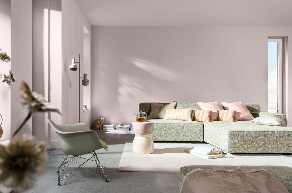
Sweet Embrace, Dulux colour of 20024
Designers like the versatility of the blush palette. Pale pink can be used on walls, flooring, textiles or tableware. The subtle shade creates a warm yet light and airy feeling. It’s an excellent partner for a wide range of other colours from verdant green to gold and tobacco brown. Pair it with dark timbers and materials like sheepskin, linen, leather of flatweave rug. The feeling is cosy, earthy and comforting.
Meanwhile, Pantone has announced its 2024 colour of the year – Peach Fuzz. Think ballet shoes and silk lingerie. Elegant and youthful or sweet and sickly? The New Jersey-based Pantone Colour Institute searches the real and digital world for fashion and travel trends, new technologies and materials to nominate a hue every year. The aim is to capture the current global mood and predict the palette of the year ahead. In 2024, Leatrice Eiseman, executive director of the institute, says they sought a shade “that echoes our innate yearning for closeness and connection, we chose a colour radiant with warmth and modern elegance. A shade that resonated with compassion, offers a tactile embrace, and effortlessly bridges the youthful with the timeless.” Not bad for a tin of paint!
For those considering adding Peach Fuzz to their décor, here are some tips. Combining it with pale blues, and lavenders will help to dilute the sweetness. Peach also plays nicely with an earthy palette of browns, greys and greens. It works well with natural timber furniture and house plants. The colour Peach Fuzz can bring a “pop of positivity” to a space, according to Ruggable. The company has collaborated with Pantone to offer a collection of rugs, including a bathmat, in Peach Fuzz. Some might say the bathroom is the best place for a colour like Peach Fuzz as it’s the shade of plug-in air fresheners and quilted toilet paper. Peach isn’t the classiest of colours but peach to their own, as they say.
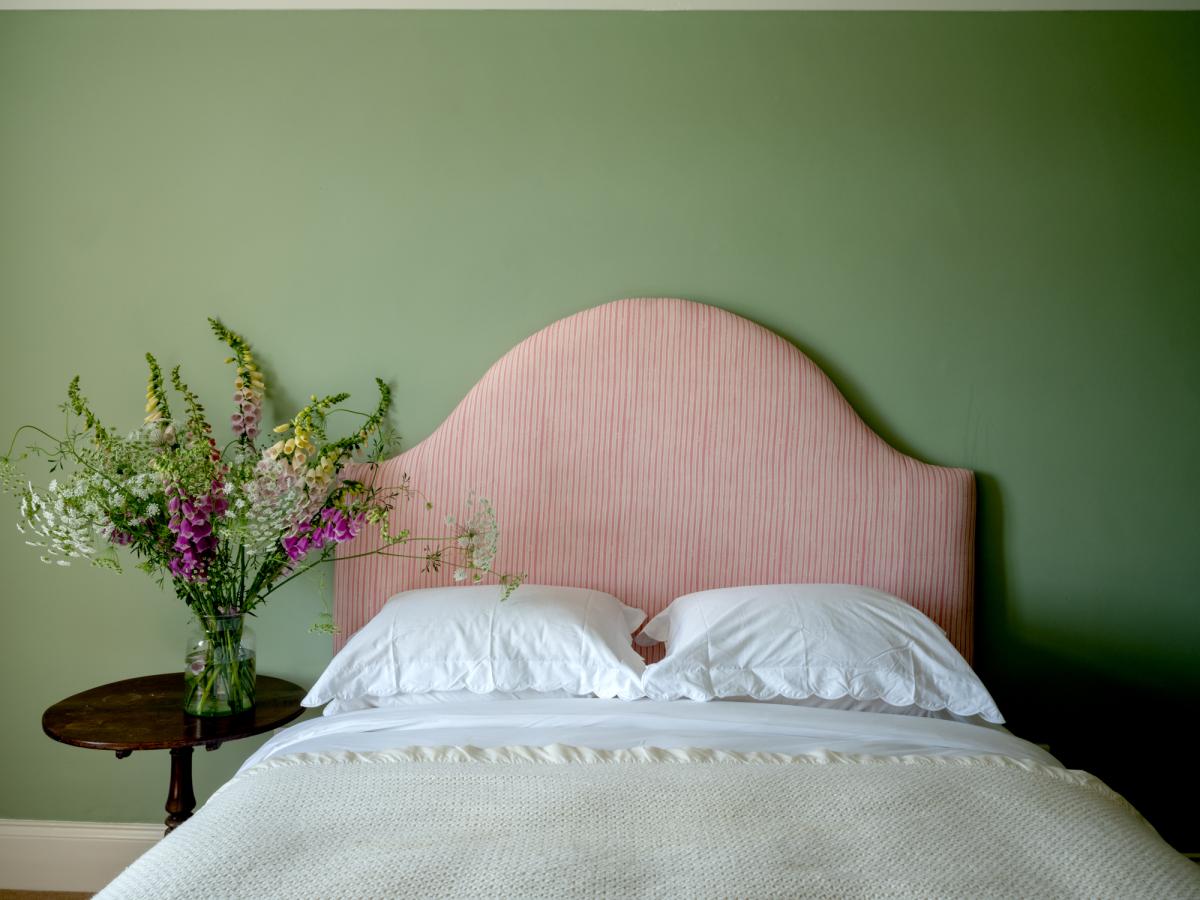
Molly Mahon pink stripe fabric
Rich earth colours, particularly brown, are also on trend this season. Little Greene noted a move away from cool greys during the pandemic and how people are opting for deeper, brown-based shades. Sweet Treats is the name of Little Green’s new collection of nine shades. The palette ranges from dark chocolate to golden caramel, honey and soft, muted pink - each inspired by a sweet treat. “Earthy shades, particularly browns, have historically been used for their practicality and are often dismissed as dated or dull,” says Ruth Mottershead, creative director of the paint company. But the new range aims to change that perception and “deliver cocooning, restful and charming spaces.” Mottershead adds: “Deeper, rich caramels are perfect for creating enticing sumptuous spaces, while soft golds provide comfort and reflect the desire to create warmth within our homes.” Juxtapose with deeper browns or softer, warmer whites for a more traditional feel. Equally, the palette will support a brighter, contrasting highlight for a more dynamic looks, says the paint company.
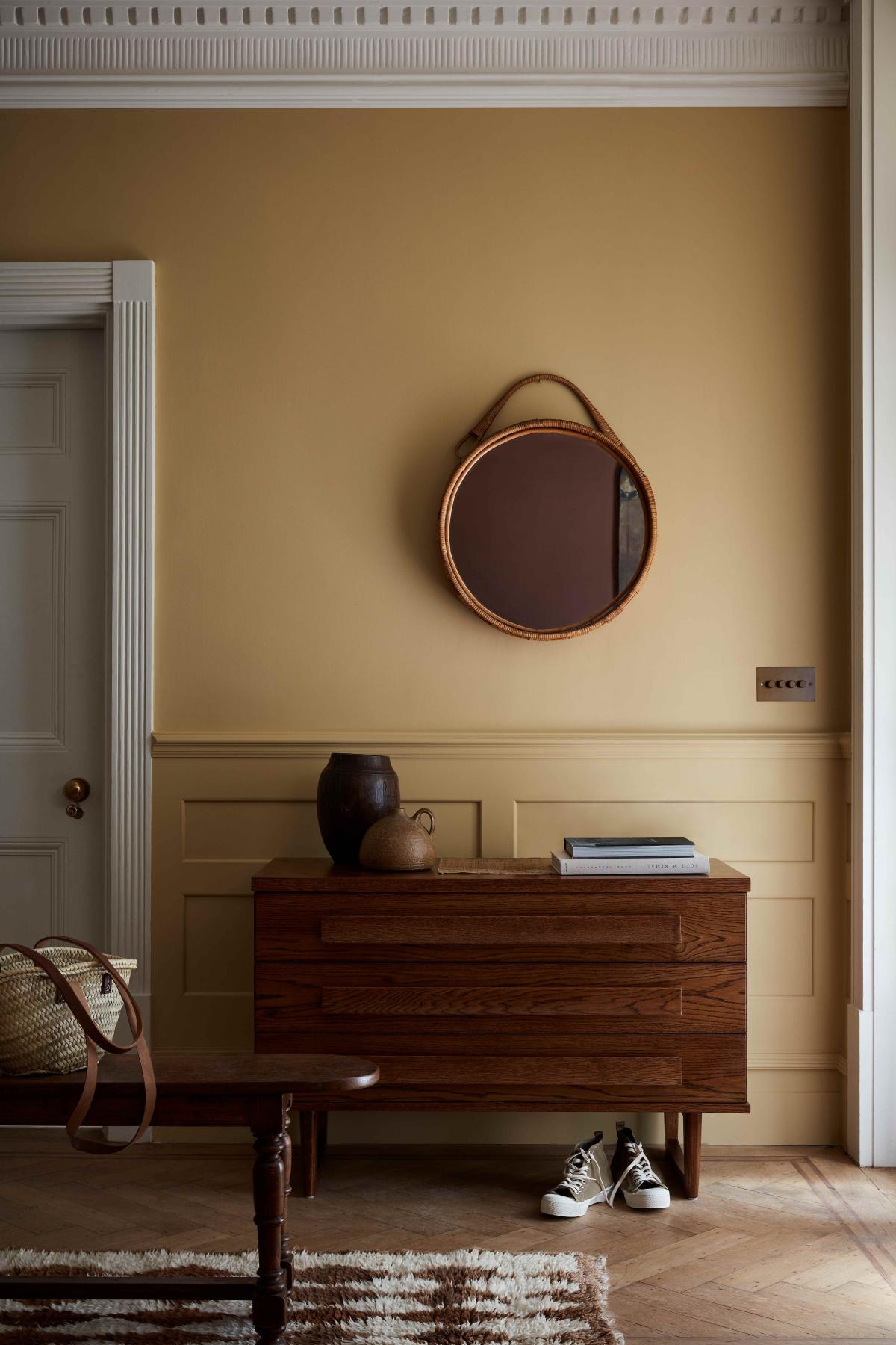
Little Greene Sweets Treats collection
If you like bold, bright colours, Farrow and Ball has collaborated with fashion designer Christopher John Rogers to create the quirky Carte Blanche wallpaper and paint collection. Inspired by childhood memories of favourite foods and comic books, the wallpaper range includes candy stripes, geometric checks and psychedelic dots. The standout green called Tomatillo is inspired by green tomatoes made by a beloved grandmother. There’s also a rich red, called Romesco, said to be evocative of a Spanish sauce of the same name and designed to pair with a bubble-gum pink or lively blue.
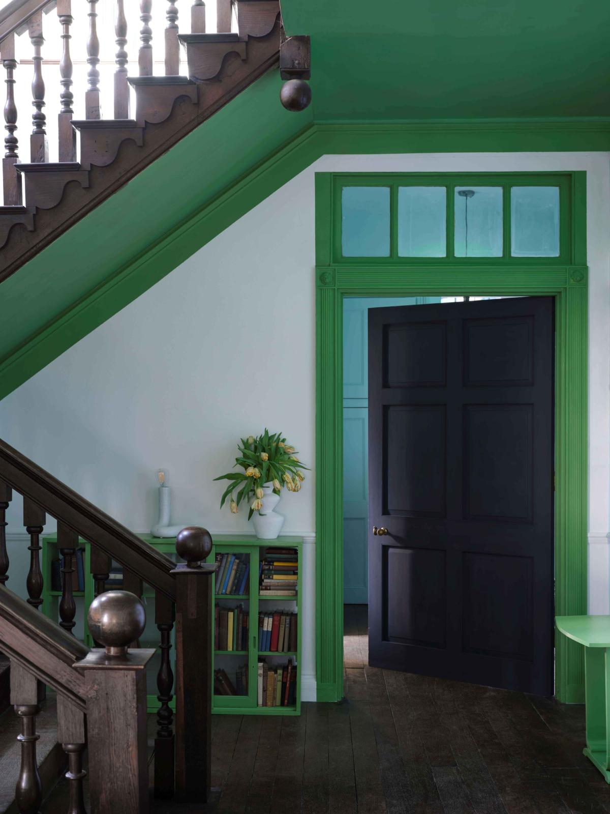
Farrow and Ball: Carte Blanche collection: Tomatillo
Take inspiration from the colours of 2024 but don’t be dictated to by the latest trends. The colours you choose will nurture you best if they reflect your own taste and personality, so choose your favourite shades. Before you open a tin of paint, remember you don’t have to revamp a whole room in the new season’s colours; you can update by painting a feature wall or a large piece of furniture, such as a kitchen dresser.