
The Colours of 2025: Transform your home with the Hottest Hues
From sunny yellows to rich browns and moody purples, here’s how to bring the latest trends into your home
Ready to leap into the new year by giving your home a colour makeover? The biggest names in paint have revealed their top shades for 2025 – and they’re as diverse as they are inspiring. Whether you’re drawn to cheerful yellows, chocolaty browns or dramatic purples, these trending shades promise to transform your interior decor.
Dulux “True Joy” – Sunny and warm
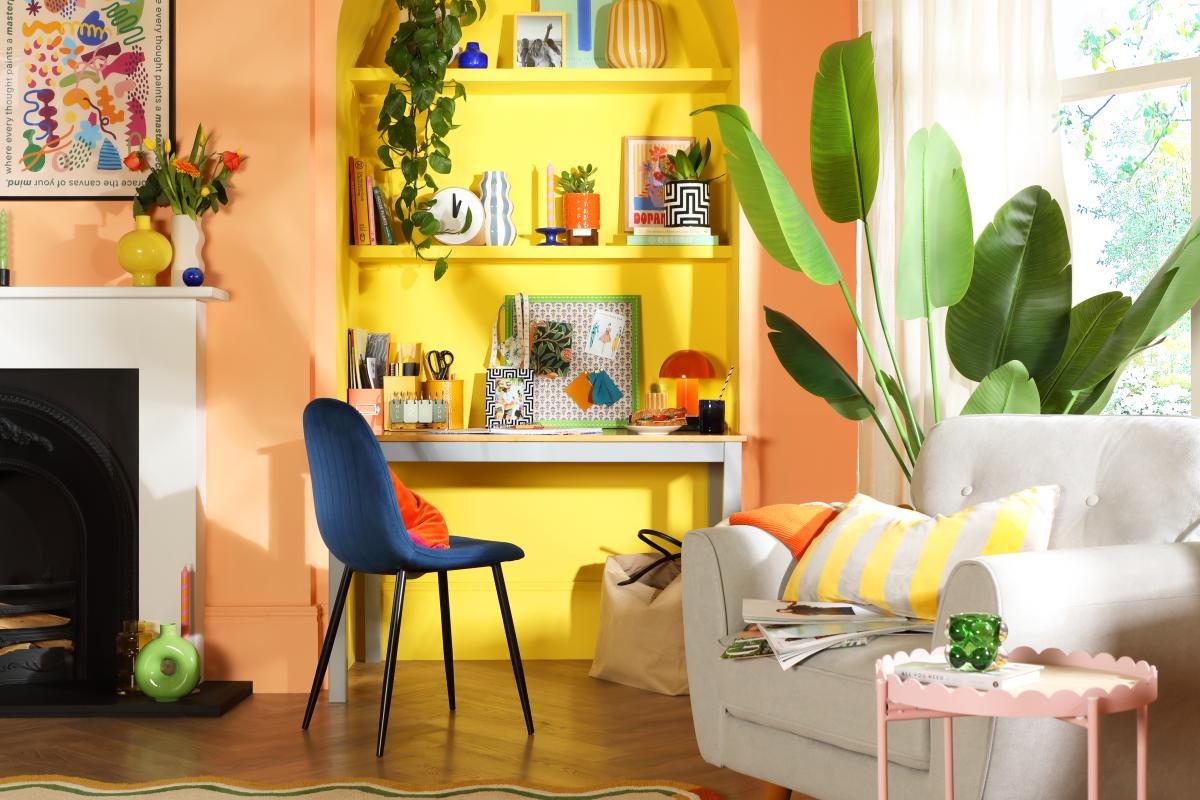
Dopamine décor office alcove, Brooklyn chair, www.furniturechoice.co.uk
Dulux has crowned “True Joy,” an uplifting yellow as its latest colour of the year. This shade is all about positivity and momentum. Jump out of your comfort zone and “say hello to yellow,” urges the paint manufacturer. Whether you opt for pale citrus tones or hot mustard, yellow is set to be a huge trend this year.
Dulux explains. “It’s a pop of colour that helps you move forward.” Use on its own as a statement shade or as a striking accent to brighten up a neutral background. In a living room, paint window frames in yellow to create a sunny ambience even on cloudy days, suggests Dulux. Pair with neutral furnishings to balance the brightness. In a home office, try using yellow in an alcove or accessories to create a positive vibe.
In the kitchen, experiment with yellow cabinetry or a feature wall. “By colour drenching your kitchen with our colour of the year 2025, you can create a space that exudes energy and excitement,” Dulux states. If you are hesitant, go buttery – it is the end of the spectrum predicted to boom. Deputy fashion editor, Hannah Rogers, painted her kitchen yellow. “It’s bright and mellow in the morning and grows warm and cosy throughout the day. It’s properly mood boosting too: a shot of vitamin D in these darker months,” she writes in The Times.
If you’re feeling bold and arty, follow Dulux’s step-by-step guide in painting a freeform shape. It’s a fun way to personalise your space with a burst of yellow.
Pantone’s “Mocha Mousse”- a Warm and Grounding Neutral
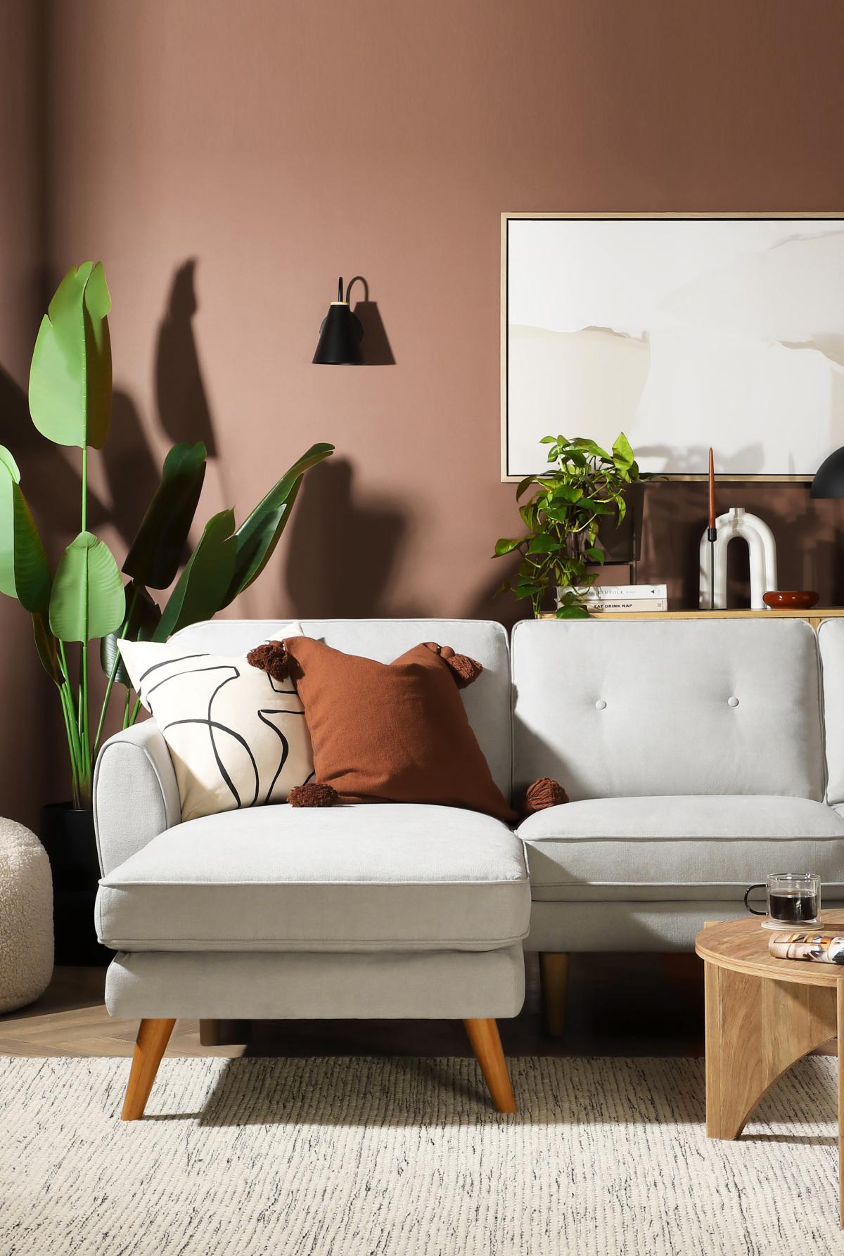
Pantone Mocha Mousse styled with a grey sofa www.furniturechoice.co.uk
Pantone’s 2025 Colour of the Year, “Mocha Mousse” is rich, chocolatey brown. “A warming, rich brown hue, Mocha Mousse nurtures with its suggestion of the delectable quality of cacao, chocolate and coffee, appealing to our desire for comfort,” states Pantone. Leatrice Eiseman, executive director of the Pantone Colour Institute, says the colour evokes “ thoughtful indulgence.” She adds: “Sophisticated and lush, yet at the same time an unpretentious classic, Mocha Mousse extends the perception of the browns from being humble and grounded to embrace the aspirational and luxe.”
Not everyone is a fan. Some critics say the colour is the equivalent of soggy toast. Others have suggested mousse means mouse, and it resembles the colour of watercolour brush cleaning water. But when it comes to painting a kitchen, dining room or bedroom, this colour might appeal if you are cautious of venturing too far into the world of colour trends. You may prefer warming light browns and taupe shades as safe choice.
Interior designer Andrew Griffiths, founder of a New Day Studio, notes Mocha Mousse is versatile enough to complement many rooms. “The colour is a natural evolution from the earthy pinks that have been popular for quite a while now and I like this move into a slightly darker, earthier direction. For me, this colour pairs extremely well with both dark and light woods and when paired with a soft off-white gives a feel of real sophistication and grace.” In the bathroom, create a spa-like retreat by combining “Mocha Mousse” with stone finishes and brushed gold accents.
Little Greene’s “Mochi”- A Cosy, Caramel Neutral
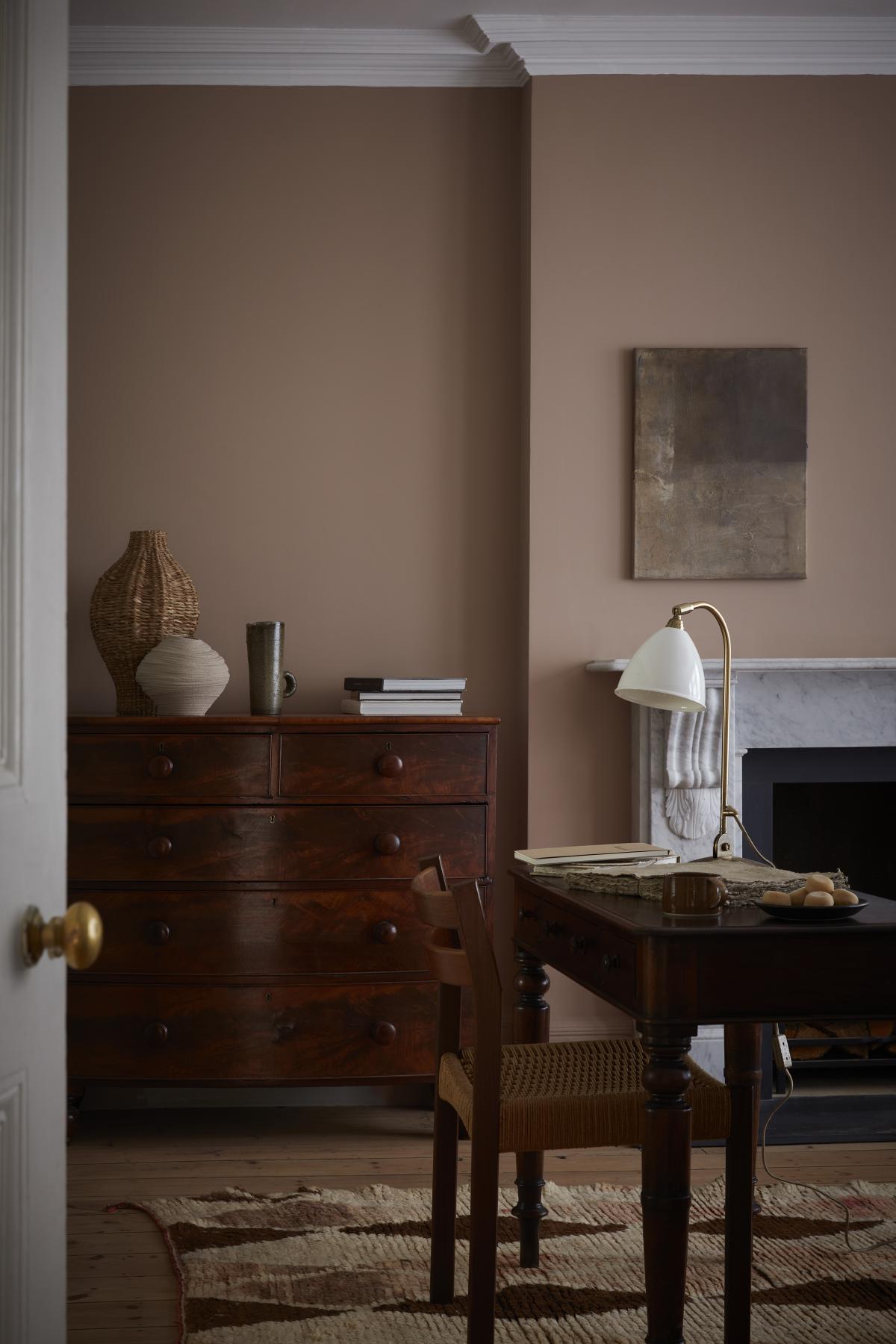
Walls painted in Mochi by Little Greene
For a softer, subtler take on the warm brown trend, check out Little Greene’s Colour of the Year 2025, Mochi. This caramel toned neutral is described as a “cosy, creamy, coffee-cake colour.” Ruth Mottershead, creative director at Little Greene, says Mochi is timeless and modern, making it ideal for both traditional and contemporary spaces. She suggests Mochi can be used in various settings from bedrooms to bathrooms to living rooms, and pairs well with earthy shades, greens, greys or wooden accents. Mocha can also serve as a neutral base for introducing bolder tones. Consider pairing with gentle greens on skirting and doors and fresh bright white on the ceiling. Alternatively, bring out the sweeter pink tones within Mochi by pairing with other pinks. Add shots of bright colour with furniture or décor. Think woven rugs, wooden chairs and ceramics.
PPG’s “Acai Berry” – a dusty violet with a touch of drama
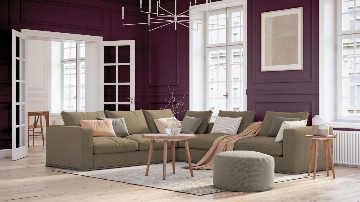
Acai Berry Johnstone’s Paint by PPG
Looking to inject some deeper, richer colour into your home? PPG’s “Acai Berry” might just be the ticket. Described as a “a dusty violet with mauve undertones,” it’s a versatile and elegant choice – not too bold or bright. “Acai Berry reflects the movement away from lighter, airier hues in favour of deeper, richer colours, a trend evident in everything from fashion to interior design,” says PPG. “This captivating hue strikes a perfect balance between the calming qualities of blue and energetic warmth of red. It’s highly adaptable and easily paired with a wide range pf palettes and colours while offering a sense of rarity.” Purple works well with milky whites, dusty pinks or lime green accents. PPG has published a palette of 40 shades expertly curated to complement each other.
Tikkurila’s “Nocturne N348” - A Deep, Sophisticated Blue
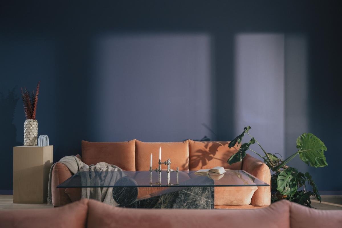
Nocturne N438 - Tikkurila
If you are looking to give your home a touch of sophistication and drama Tikkruila’s Colour of the Year, Nocturne N438 is a shade worth considering. This rich, deep blue-grey is designed to envelop your space in a sense of calm and elegance. A great alternative for anyone looking to explore darker hues in their interior whilst steering clear from blacks and darker greys.
Integrating Nocturne N348 in your interior couldn’t be easier as it pairs effortlessly with lighter shades such as neutrals or pale yellows. Whether you are looking to create a cocooning effect by wrapping an entire room in this deep blue, define an accent wall to add depth, or experiment with colour zoning in a dual-purpose space, Nocturne N348 adapts beautifully to suit your design vision.
Also, it is particularly effective at balancing out the warm natural light that South-facing rooms receive, helping to create a soothing and harmonious atmosphere, while adding a sense of depth and richness to the space.
Try to balance striking shades like bright yellow and violet with softer, neutrals to prevent overwhelming the space. Not ready to paint a whole room in these colours? Use as accents by adding these colours in smaller doses – think window frames, feature walls or staircases. Natural and artificial light can change the way a colour looks, so test paint samples in your space before making a final decision. Trends are great for inspiration, but your home should reflect your personal tastes. Choose colours that make you happy.